Making my first Rivals of Aether Stages
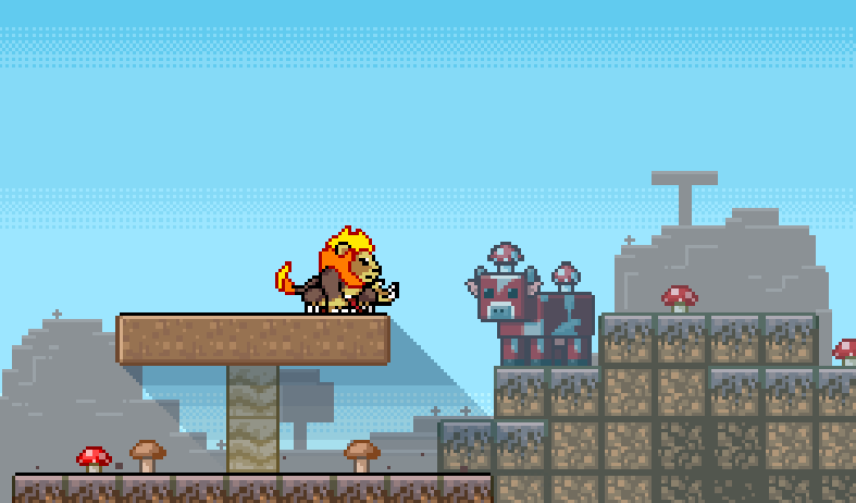
Creating custom content for Rivals of Aether has always been something in the back of my mind that I've wanted to do, and today, I want to share the process of designing and building my first two custom stages, "Vim Factory" and "Mushroom Fields". So whether you're a seasoned creator or just getting started in the Rivals Workshop, I hope this process of mine provides some inspiration and guidance for your own projects.
Concept & plan
So, going in, I kinda had a solid idea of what I wanted to do with the stage, I wanted a basic version, having the default layout seen on many Rivals stages. And then make an Aether version, which usually includes some kind of gimmick on the stage.
However, I do not have any experience with coding and therefore don't really know how to implement scripts and such for stage gimmicks. So, to make my Aether versions more interesting, I would ditch the symmetry and make my own unique layouts for them.
Making the stages
VIM FACTORY:
Having played Mario & Luigi: Partners in Time since I was little, this location always got stuck in the back of my mind. It was one of the few locations that I never forgot.
To start I began by looking at the original stage's design and translating it over to Blender, as I wanted to have a good reference for where everything in the environment would go.
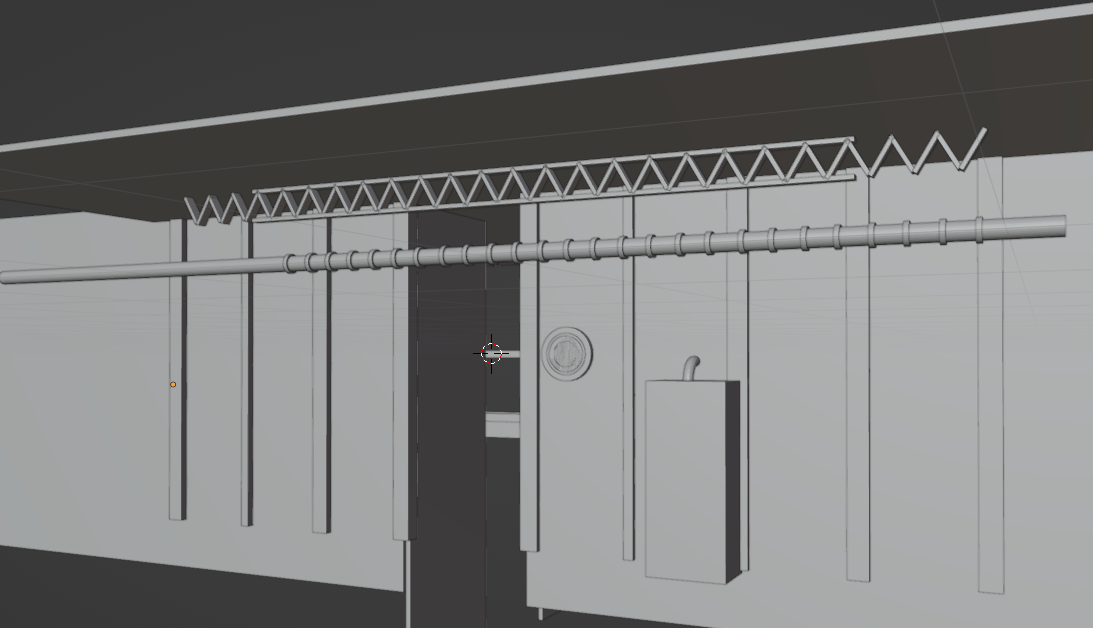
One most iconic aspects of the Vim Factory's setting was its usage of color, with various shades of purple and magenta appearing all over the walls of the factory, only contrasted by the bright green fluid that flows through the factory's pipes and its orange machinery.
I started with the basic battle layout seen on many custom Rivals stages and added the ground platform first, ensuring that it aligned with the collision.
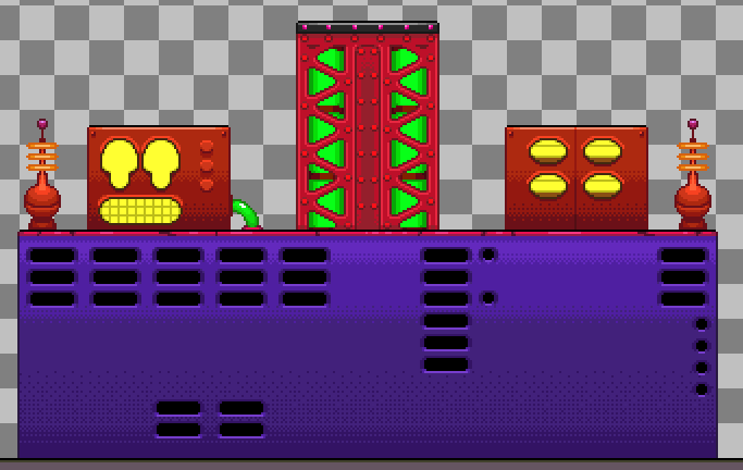
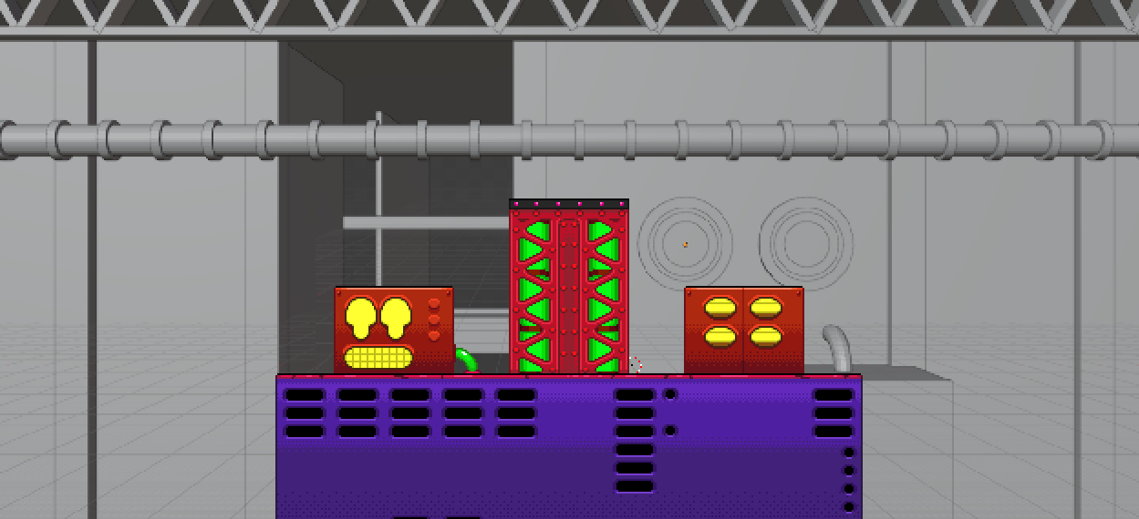
After working on the ground, I started working on the details for the background. With the 3d reference I had made, it was a lot easier to get everything in place and make the whole environment.
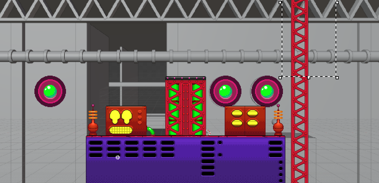
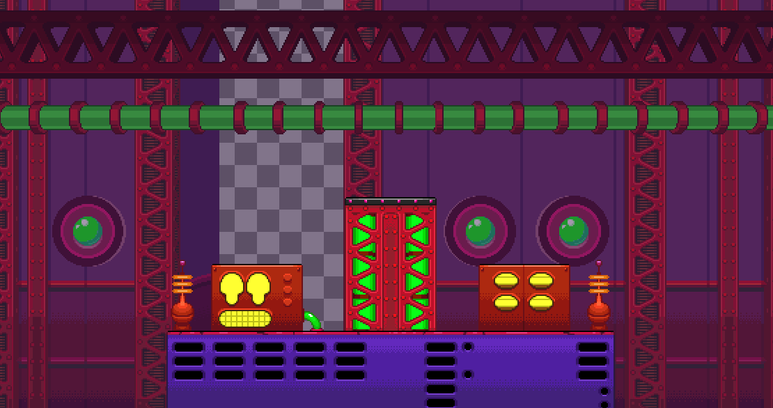
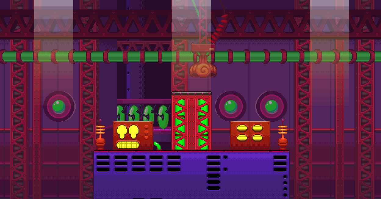
After everything was set, I started making all the animations to make the factory feel more active.
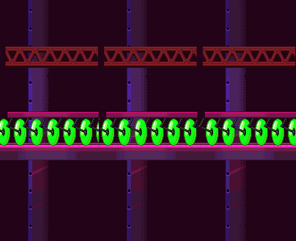
Rivals uses strips to display and run animations in-game. So all the animations I did are displayed as such. Here are two examples, one being the conveyor belt in the back, and the other being the displays and tubes on the ground platform.

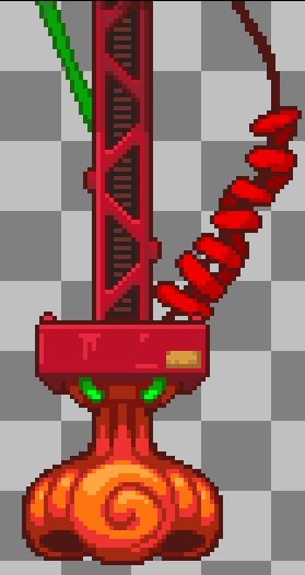
One more thing is that layers can be repeated infinitely and moved automatically. So I drew the bizarre nose mechanism from the Partners in Time game and gave it tons of lengthy space to loop back after a short period.

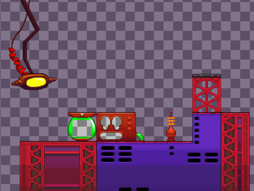
Finally, to finish off the stage, I worked on the Aether version, making a unique layout for the stage. I reused a bunch of the assets from the background to form the new layout which saved me a bunch of time and also made the Aether version more visually distinct.
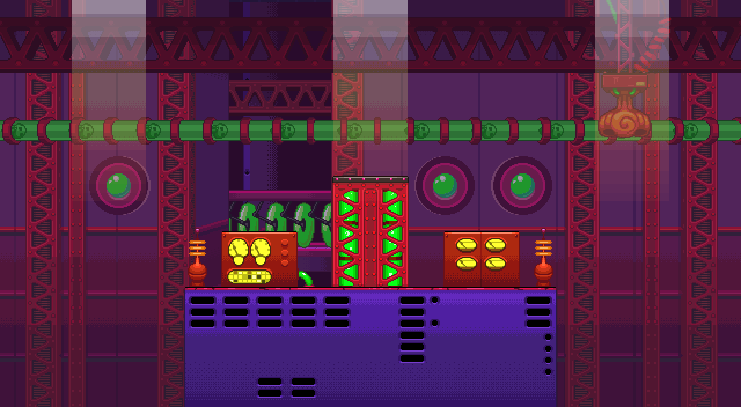
One thing I should mention is that Rivals only allows up to 9 layers in total. 1 for the ground, 6 for the background, and 2 for the foreground. All of these have their Aether versions as well.

So I can only do so much animation and detail before the game limits me. But I'd say that allows for some creative solutions. Was definitely fun for me trying to optimize and layer everything together in a nice way.
MUSHROOM FIELDS:
I was originally tempted to make another Mario & Luigi stage, but I decided to change franchises instead and do a Minecraft stage.
Much like with Vim Factory, the setting is one that I never forgot and felt very unique to its franchise. The Mushroom Fields were always such a unique location in Minecraft to me.
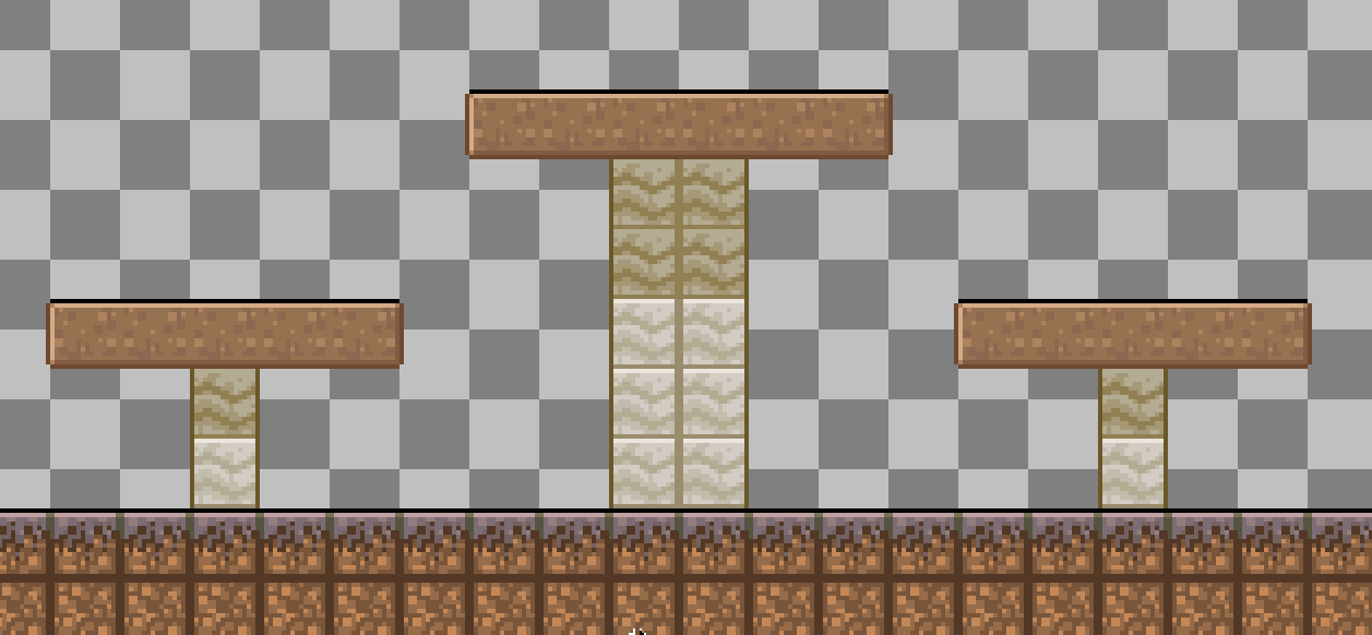
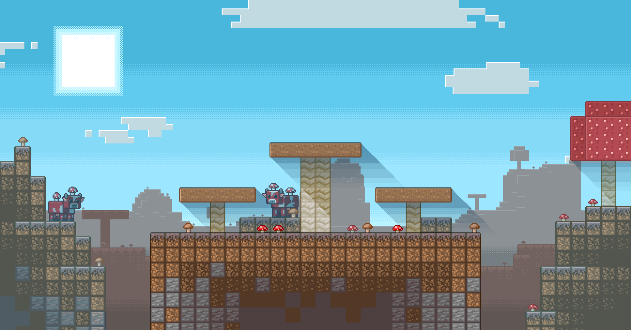
To get a basis, I began making the dirt block and copy-pasting it to fit the stage's proportions. Then I drew the mycelium block on top of it along with the big brown mushrooms to act as the platforms. I also added a gradient to the dirt since it looked too basic.
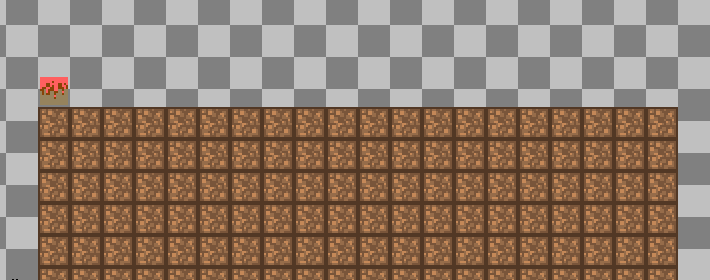
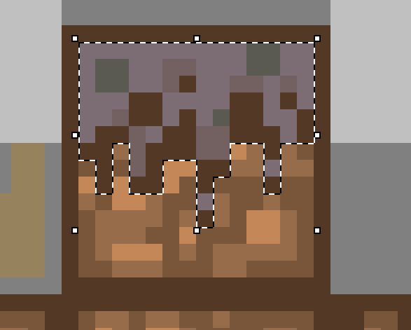
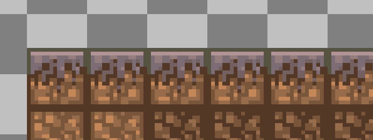
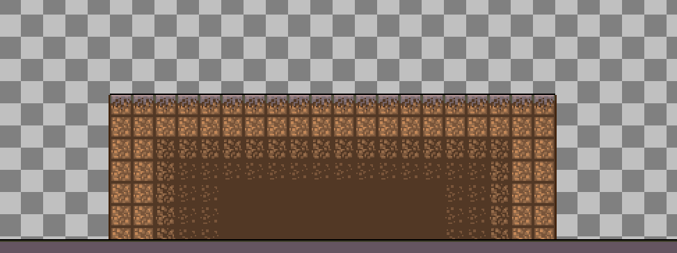
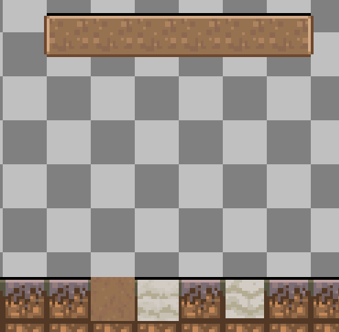
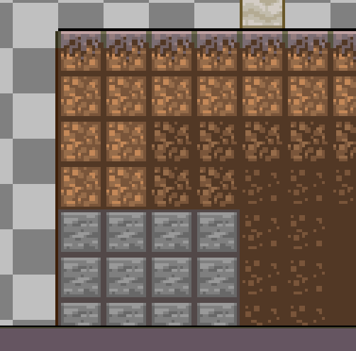
However, I still wasn't satisfied with the dirt and put stone decor all over it. Trying to mimic the terrain generation seen in the original Minecraft. Finally thought this looked good enough so I left the stage at that.
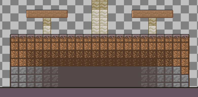
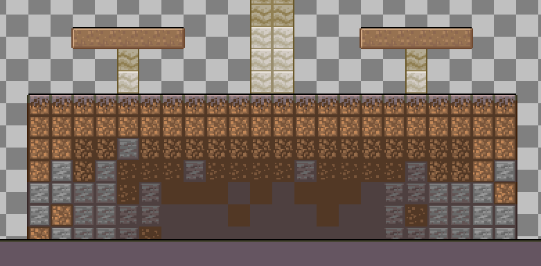
The stages did feel kinda shallow with no varying terrain to look at, so I quickly used what I already made and made a few mountains on the side. I forgot to put in the little mushrooms that grow everywhere on this biome.
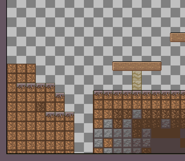
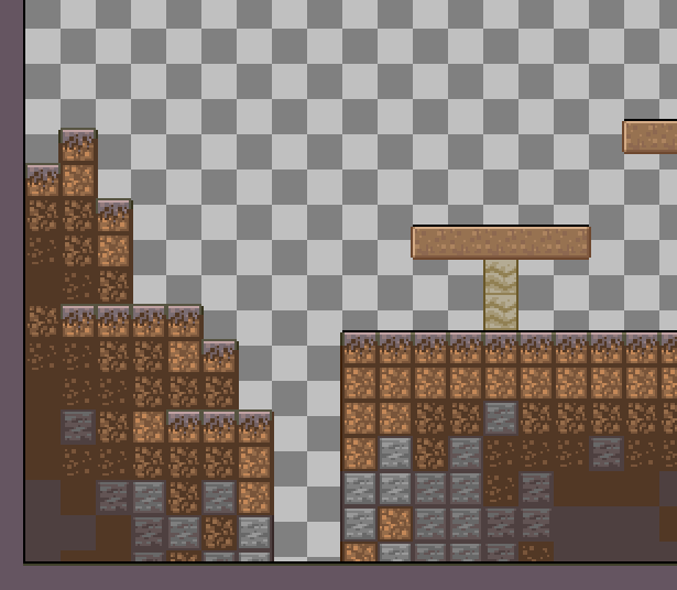
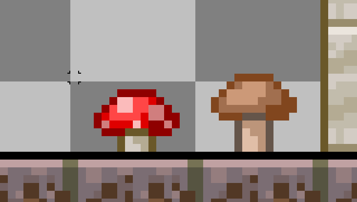
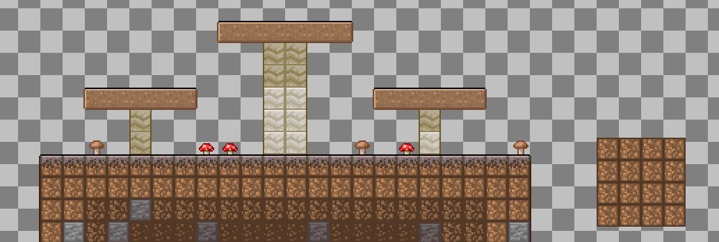
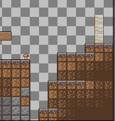
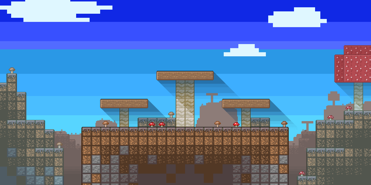
Then, after a bit of experimentation, I made both a new sky and a new layout for the Aether version.
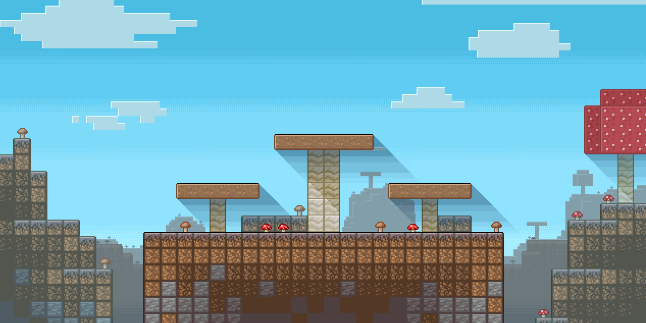
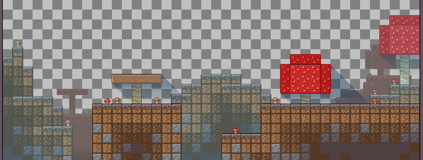
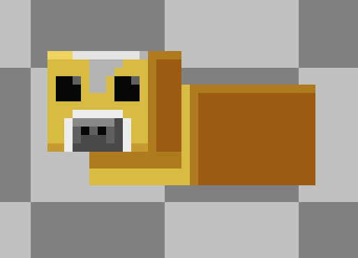
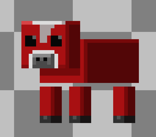
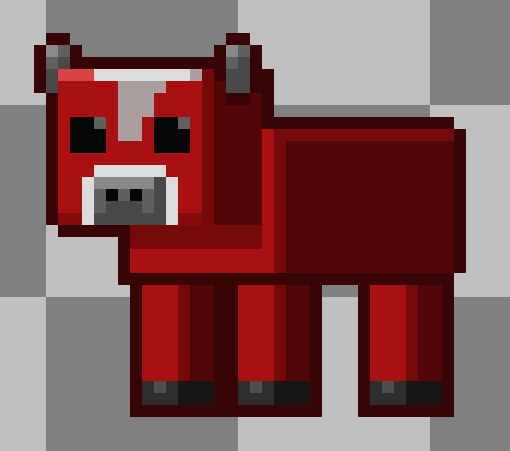
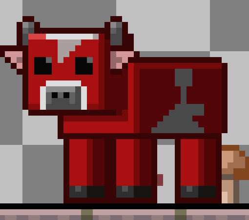
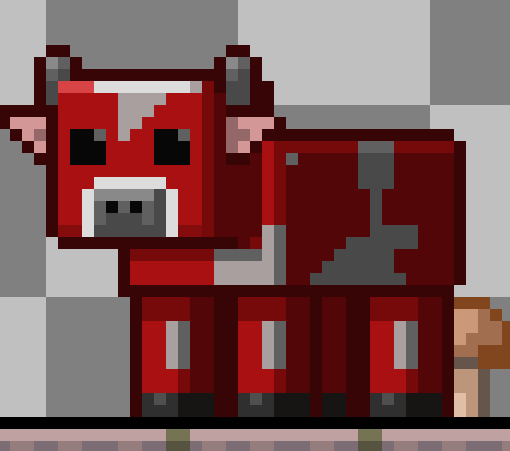
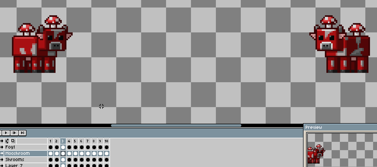
Of course, this wouldn't be the Mushroom Fields without its endemic creature, the Mooshroom. Luckily I've gotten used to drawing Minecraft mobs with my Block Brakers racer pack, so it was pretty easy to assemble this Mooshroom together and animate it.
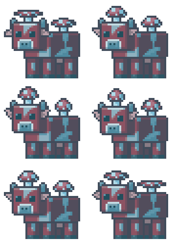
I also made another version of the Mooshroom with different shading to stay consistent with the lighting present on the stage.
One thing I didn't mention in the Vim Factory section is that I drew the franchise's respective logo for each stage, as Rivals has actually done this for its base stages when doing crossovers. Seeing the Minecraft logo at this resolution feels pretty neat, to be honest, feels like it came out of a retro title from the '90s.


And after a last minute change to add the sun, the Mushroom Fields were done, and so was my second custom stage for Rivals of Aether.
Conclusion:
Making custom stages for Rivals of Aether is a rewarding experience in my opinion. Not only do you get to bring your creative vision to life, but you also contribute to the community by sharing your work. I hope this behind-the-scenes look at my process inspires you to start or continue, making your own custom stages.
You can try out either of my custom stages over on Steam. I'll be sure to create and publish more stuff in the near future. Until next time, folks!


